Hello Bill Miller!! I really love this sepia pic even though the colour one is great to! I adore old buidlings and when you come across something like this ... well is just takes you back in time .... Gena @ thinking aloud South Africa
J'aime beaucoup ces photos sépia, en phase avec le livre que je viens de finir ! j'ai commandé le film To Kill a mockingbird avec G. Peck, j'ai hâte de le voir ! Bises PS je ne vous vois plus dans mon salon ?
No contest here. The sepia version is wayyy better. Using the color filter idea for the transformation is intuitive and it works well -- just the same as if you screwed a color contrast filter on your lens when shooting B&W film.
As a retired but still crazy lover of pics, i am always pleased to come across someone who enjoys taking pictures. may I ask a question? Do you think a picture should always represent the subject honestly? Or is it an opportunity to make something new, as with sepia for instance? (ignoring news/journalism etc.)
What do you feel about increasing the colour saturation and contrast on 'grey-day' pics like some of those above? I think white skies have to remain white because any change here can look false. But they can be limited or given shape by finding things to stick in front. Don't be offended by the gratuitous crit. Bob
Barangaroo, metro station
-
Barangaroo metro station is an underground station on the Sydney Metro North
West & Bankstown Line in the inner city suburb of Barangaroo. It opened in
20...
Back in the Saddle Again
-
I'm finally beginning to get back on my bicycle, and I've finally begun
recording the miles of the new chapter of my life.
It is not easy. I cry every si...
The Story Behind Saint Francis Dancing on Water
-
We had our family vacation earlier this month. Our first stop was Santa Fe,
New Mexico. The morning after we got there we were eager to get outside and
wal...
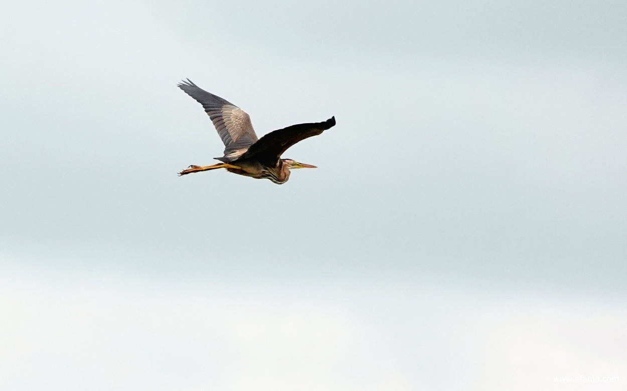
Bloemen en vogels
-
Het bleef hier lang bewolkt de afgelopen dagen. De maximumtemperatuur is
alleen vrijdag en gisteren boven de zomerse 25°C. Dat beviel me op zich
prima, maa...
The Best Restaurants in Oklahoma (Updated for 2026)
-
A Few Key Points About This Guide Oklahoma’s food scene is no longer just
about a handful of great steakhouses and fried food – by 2026, it’s entered
a who...
LOOKING OUT FROM A CAFE ON A DULL MORNING
-
[image: Buildings and rooftops, chimneys, spikes etc. Taken from inside a
cafe so backwards writing across window and reflection of light indoors.]
Loo...
Cloud reflections
-
Clouds reflected everywhere! Also seen on Through My Lens Monday, Blue
Monday, Tuesday’s Wordless Wednesday, Wordless Wednesday, Little Things
Thursday, Sk...
Link Latte 285
-
*#285*
To Scale! The Solar System - [one of the best videos]
The Hardest Gear In The World That Will Take Forever to Spin - [wow video]
Welcome to Scuba K...
Lahti
-
I am in Lahti, Finland, to give a talk at the Lahti Symphony's Sibelius
Festival. I've been wanting to visit since I encountered Osmo Vänskä's
revelatory B...
..and then this happened.
-
If you have read my last few posts you will know that 2022 was not a good
year for my family, and by that I mean it was the *worst *of years! After a
...
Hit the pause button
-
Hello dear blog friends and followers! I've decided to take another break
from posting on my blog...... I'm not sure if I'll occassionaly post again
or no...
Entry H
-
The City Daily Photo theme for February is “Entry”, and my entry is
entitled “Entry H” — showing a glimpse of the crowd moving into Eden Park
stadium last ...
It's been awhile...............
-
I hadn't thought about my blog in a very long time so I stopped in and
couldn't believe how much traffic is still stopping in. The last time I
had posted ...
1 – 2 – 3 in Stockholm
-
I was visiting Stockholm with a friend for a “photo safari”. Just walking
along one of the many quays in the beautiful weather led to many (at lest
for me)...
Florida Scrub-jay
-
[image: Florida Scrub-jay]
The Florida Scrub-jay is a rather unique bird. This member of the Corvidae
family is found only in central Florida. It is the on...
Theme Day - Looking Down
-
Taken from the top of the southern pylon of the Sydney Harbour Bridge.
Looking due east, down the harbour, out to the Pacific Ocean.
This post is my contr...
Coucou...
-
*Bonjour*
*Je ne sais pas s'il faut tenir la barre dans notre pays bien arrosé, voire
inondé, mais un petit déclic et on reprend le cap !*
*Le déclic ét...
Air Pig
-
*Smile Pig!*
*Have you ever flown a dear pet across the country without going along for
the ride? If not, let me tell you, it's a real TREAT! If you are f...
Shadow Shot Sunday 218 - Saatchi Gallery, London
-
Strong sunlight in February hits the facade of the Saatchi Gallery in
Chelsea where currently a fascinating exhibiton "Pop Art : East meets West"
is cur...
The End!
-
Here we are...! It's been nearly 10 years, though it seems like just
yesterday, when I started posting a photo a day of Paris on this blog after
I was gi...
The Bank at 320 South Boston
-
320 South Boston Building today.
Artist's rendering of completed building prior to expansion.
This handsome 22-story high rise building with 10 story...


11 comments:
I prefer the sepia picture - much more atmospheric.
Hello Bill Miller!! I really love this sepia pic even though the colour one is great to!
I adore old buidlings and when you come across something like this ... well is just takes you back in time ....
Gena @ thinking aloud
South Africa
I too love the sepia version more. :)
Oh ow, the sepia one looks so strikingly 'old time', amazing :D
J'aime beaucoup ces photos sépia, en phase avec le livre que je viens de finir ! j'ai commandé le film To Kill a mockingbird avec G. Peck, j'ai hâte de le voir !
Bises
PS je ne vous vois plus dans mon salon ?
No contest here. The sepia version is wayyy better. Using the color filter idea for the transformation is intuitive and it works well -- just the same as if you screwed a color contrast filter on your lens when shooting B&W film.
Marvelous old building. Love the signage.
I love the way you posted the original and your version. It adds to the appreciate the viewer has for the shot. Thanks for sharing!
The sepia gives it so much more of a historic flavor. And when you compare it to the skyscraper scene below in the next post... Very well done!
The sepia version makes me feel like I'm in a Far-West movie. Love it!
As a retired but still crazy lover of pics, i am always pleased to come across someone who enjoys taking pictures. may I ask a question? Do you think a picture should always represent the subject honestly? Or is it an opportunity to make something new, as with sepia for instance? (ignoring news/journalism etc.)
What do you feel about increasing the colour saturation and contrast on 'grey-day' pics like some of those above? I think white skies have to remain white because any change here can look false. But they can be limited or given shape by finding things to stick in front. Don't be offended by the gratuitous crit. Bob
Post a Comment